Your Knowledge Base is moving on 3/25/24! Our new Help Center provides all the articles you know and love (plus so much more) in a one-stop shop. Ask your SPoC for details!
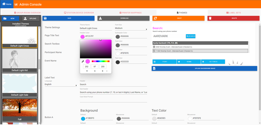
In the Themes area of the Admin Console section in Check-In Suite, you can manage, edit, and create themes for your Check-In Kiosk. Check-In
Suite comes with five pre-loaded "default" themes that you are welcome to use or edit!
Add a New Theme
Click New.
Name your Theme.
Click Submit.
To add a background image:
Click the Upload Background Image button beneath the theme sample on the right.
Browse to the desired background image, and click Open.
Select the Font Size.
Set the Search Text.
Set the colors you want:
Enter the color name or hex code, OR
Click the color circle beside the field and selecting from the color picker.
Review your theme preview on the right.
If you need to start fresh, click Reset.
Click Save.
Note: When making changes to a theme's image, your browser's cache may need to be cleared to reflect in Check-in Suite.
Edit an Existing Theme
Select the existing theme from the list of installed themes.
If needed, upload a new background image.
If needed, make changes to the element colors.
Review your theme preview on the right.
Click Save.
Editing Theme Colors
Set colors for the following elements by entering the color name or the hex color code (e.g. #00FF00). If using the color code, include the hash symbol (#). If you don't know the code, you can click the color circle beside the field to select from the
color picker.
Page Title text header color
Page Title text sub-header color
Search textbox background color
Search textbox text color
Participant Name background color
Participant Name text color
Event Name background color
Event Name text color
Event Name selected color
Button A background color
Button A text color
Button A hover background color
Button A hover text color
Button B background color
Button B text color
Button B hover background color
Button B hover text color
Button C background color
Button C text color
Button C hover background color
Button C hover text color
Editing Search Text
Choose a language.
Set a Search header (for example, "Search:").
Set a Search subheader (for example, "Search using your 10 digit phone number").
Set a Care Note Prompt (for example, "Input Pager No. or Parent Location").
Note: Search header, Search subheader, and Care Note Prompt are limited to 255 characters.
Button Functions
Button A = Main Actions
Search
Try Again
Preview
Check-in or Print
Check-in Completed (Done)
Numbers and letters on-screen keyboard
Button B = Secondary Actions
Home (Back)
Scroll Up/Down
Back (Preview)
Prev/Next Household
Button C = Config/Edit Actions
Settings
Add/Edit Household
Add Guest Settings
Delete and Shift on on-screen keyboard
Clean Screen button and countdown
Delete an Existing Theme
Select the desired existing theme from the list of installed themes.
Click Delete.
Confirm Delete.
Upload and Download Themes
You can download a theme to share with other MP churches by:
Select the desired existing theme from the list of installed themes.
Click Download.
Share the zip file as desired.
You can upload a theme if it was originally created in the Check-In Suite Admin Console:
Click Upload.
Browse to the desired theme zip file.
Click Open.
Edit, if needed.
Notes About Themes
Theme Preview: The theme preview is a sample of the elements chosen. It is not an exact replica of how your theme will appear spatially when using that theme in the Check-In Kiosk. Also note that the Header/ Subheader text does not update in the preview.
Image Size: If the image size does not match your screen resolution, the image will be stretched based on width with height cropped when using that theme in the Check-In Kiosk.
Font Size:
If using an iPad, tablet, or smaller device, we recommend the Extra Small or Small font size.
Font size selection does not mean that all font used in the theme will be the exact same size. Keyboard, number pad and button fonts are defined to optimize space and usability without making other font (for example, search instructions) overly
large or small.
Check-In Kiosk: Themes only apply to the Check-In Kiosk (not the Admin Console or Classroom Manager). In Check-In Kiosk, all unattended screens are "themed" - Search, Results, & Preview, but attended forms - like Add/Edit Family
are not "themed".
Uploading and Editing: Only themes originally created in the Check-In Admin Console can be uploaded for use and editing.
Pre-Loaded Themes: Check-In Suite comes with five pre-loaded themes that you can edit or copy.
Professional Services: You can engage Professional Services to
recreate existing themes from Check-In 2 in the new Check-In Suite. Hourly rates apply.
Reminder: Themes are custom to your system (similar to custom views). Emailing Support to troubleshoot issues with custom themes will require you to engage Professional Services. Hourly rates apply.
Video Topics: Configuring Themes
0:26 - Security Roles for Check-in Suite 1:04 - Preview area 1:22 - Text, Search, and Results areas 1:54 - Buttons 2:45 - Changing the formatting 3:04 - Additional Functionality
When autocomplete results are available use up and down arrows to review and enter to select.