The Map My Selection Tool allows Users to map and filter a selection of addresses.
Basics
- Plot addresses (including those with Apt/Suite numbers) on an interactive map from a selection of records.
- The tool must be launched from a selection of records in Grid Layout and is available on thirty-four pages. Note: Launching the Map My Selection Tool from a subpage is not supported. Instead, select the desired records from a sub-page, transfer the selection to a main page, and launch the tool.
- You can map up to 1,000 records at a time.
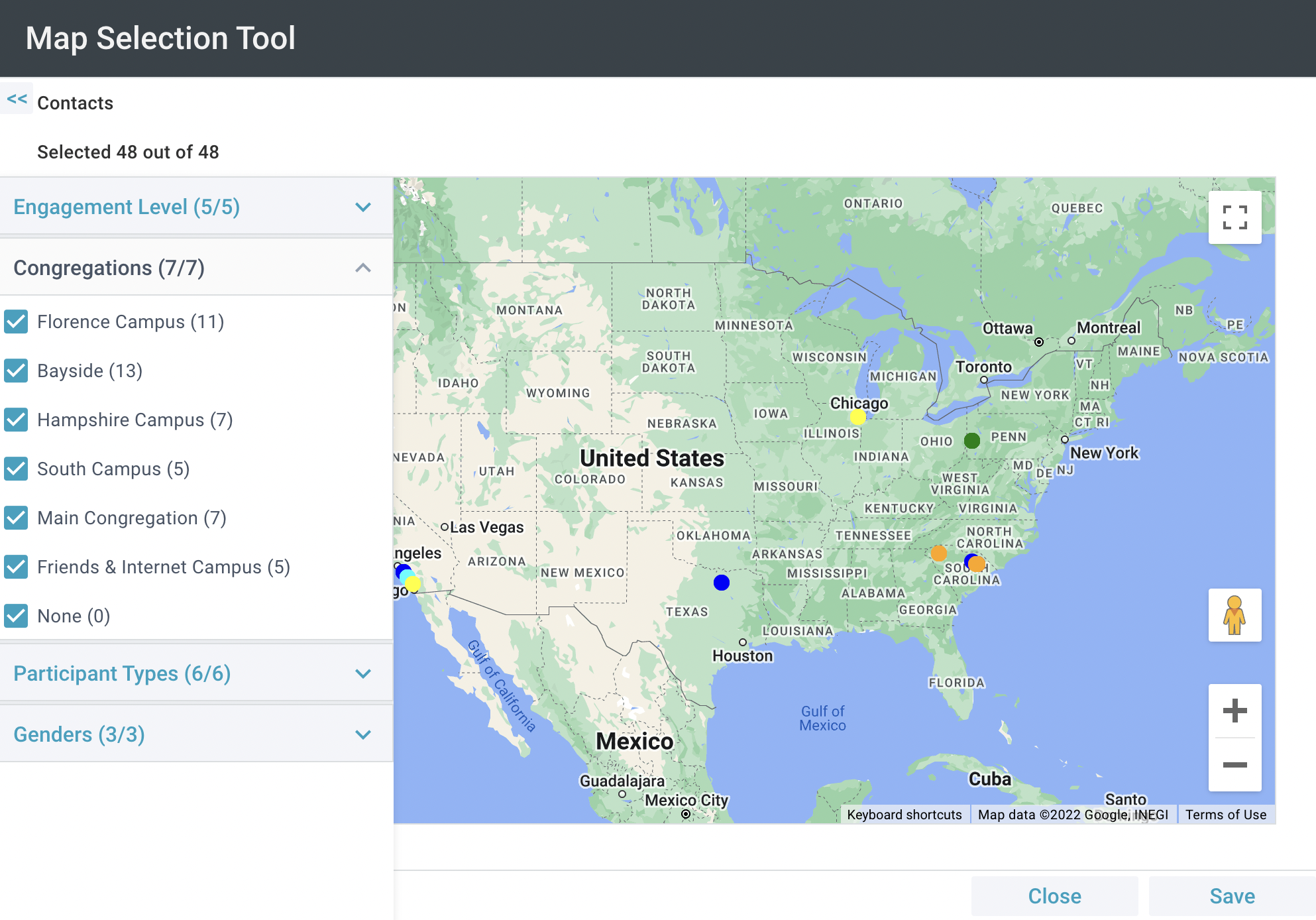
- Color-code map points based on Congregation, Participant Type, Gender, and Last Household Activity.
- Filter the addresses by Engagement Level, Congregation, Participant Type, or Gender
- Click on one or more map points to save that selection back to the Contacts page (or hold the Shift key while dragging your cursor across the desired area to quickly select desired records).
- Zoom in on map points to hover over them and see the names of individuals who live at each location.
- Printing the map provided by this tool is currently unreliable. Instead, you could take a screenshot of the map and paste it into another program.
Initial Setup
 A SPoC must complete a one-time initial setup in order to use the Map My Selection Tool.
- Obtain a Google Maps API Key.
- Administration > Configuration Settings and update the following Configuration Settings. When doing so, double-check that you have no trailing spaces in the Values of each Configuration Setting, as erroneous spaces can cause errors when using the
tool.
- COMMON, GoogleMapsAPIKey: Add (or confirm) your Google Maps API Key.
- Grant user access to the tool via the Security Roles and Tool Permissions.
Using the Map My Selection Tool
- Select desired records from the Grid Layout. Note: The page you build your selection on will determine what addresses are plotted.
- Households Page: Displays the Household Name and Address Line 1.
- Groups Page: Displays the Group Name and the Group's Offsite Meeting Address.
- Events Page: Displays the Event Name and the Event Location Address.
- All Other Pages: Displays the Household Address associated with the selected individuals.
- Click Tools > Map My Selection.
- A pop-up window indicates how many records will be included on the map. You have the option to:
- Load: Takes the User into the tool with the map.
- Save Error Data: If there are any records that cannot be processed you will see the number of errors, and the option to save them to a Selection. A Selection will be created on the page from which you launched
the Tool.
- Cancel: Returns the User to the platform.
- After the map loads, you can filter the addresses. Click > to expand the summary and filtering options. You can filter by:
- Congregation
- A None option is available for all Household records with no Congregation.
- Users can see all available Congregations that make up the total represented in all of the selected records.
- The plotted addresses will appear on the map with different colored pins to denote the different Congregations.
- Engagement Level
- A None option is available for all Participant records with no Engagement Level.
- Users can see all available Engagement Levels that make up the total represented in all of the selected records.
- The plotted address will appear on the map with different colored pins to denote the different Engagement Levels.
- Participant Types
- A None option is available for all Participant records with no Participant Type.
- Users can see all available Participant Types that make up the total represented in all of the selected records.
- The plotted addresses will appear on the map with different colored pins to denote the different Participant Types.
- Gender
- A None option is available for all Contact records with no Gender.
- Users can see all available Genders that make up the total represented in all of the selected records.
- The plotted addresses will appear on the map with different colored pins to denote the different Genders.
- After the map loads, Users can:
- Hold Shift + Click or Drag and segment to select/deselect all pins in that area with their cursor.
- Zoom in and out and move the map by clicking the map and holding as you drag.
- See the total count of selected plotted points.
- Save a Selection.
- Close the Tool.
