There are several ways to customize the branding for your MinistryPlatform instance. When the Platform is customized to match your church's branding, congregants can feel confident that they're in the right place. This is important when they enter personal
information and need to be reassured that it will be kept safe and secure.
CSS for Authentication Screens
You can add your own color scheme and background to your Log In, Reset Password, and Sign Up screens. Note that Professional Services does not offer this customization as a paid solution. However, you can use our sample file to see all the available customization
options.
- Go to System Setup > Domains/Accounts.
- Open your organization's record.
- Expand the Files section on the right.
- If you already have a file called "stylesheet.css" attached to your Domain record, you can either download and edit it directly, or you can start with the sample file and overwrite your existing file.
- Download the sample file: sample_stylesheet.
This contains all the custom variables you can use to build your CSS branding. Use as few or as many as you want. - Edit either your existing file or the sample file as needed. Check out the "CSS Variables" section below for more information.
- If you started with the sample, rename the file "stylesheet.css" (removing "sample_" from the beginning).
- On your Domain record, in the Files section, click the delete icon trash can beside the existing "stylesheet.css" file, if you had one.
- Click Attach File.
- Drag and drop the CSS file, or click inside the dotted line box to browse for the file.
- Click Attach.
- You may have to refresh your browser, refresh the application cache,
or clear your browser's cache to see the change right away.
CSS Variables
Descriptions and default values of all available CSS variables for branding.
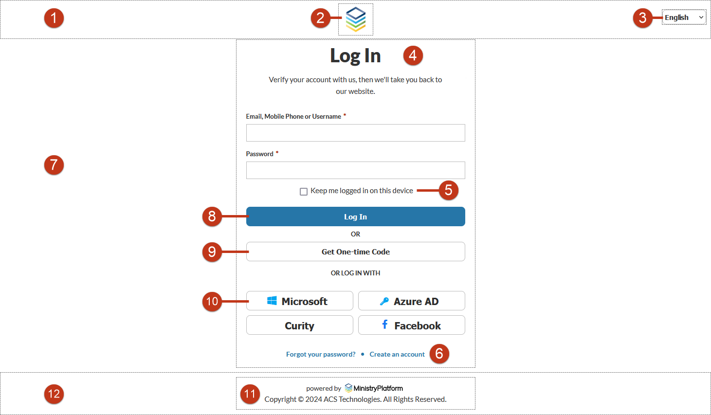
Header:
- (1) Adjust header height:
--header-height. Default is 60px. - (1) Background color for the header:
--header-background-color. Default is #ffffff. - (2) Background color for the logo:
--logo-background-color. Default is transparent. - (3) Background color for language selector:
--language-selector-background-color. Default is transparent.
Global:
- Font family for text:
--font-family. Default is "Lato", sans-serif. - (4) Default text color:
--text-color. Default is #222222. - (5) Lighter text color for contrast:
--text-color-light. Default is #2e2e2e. - (6) Color for hyperlinks:
--link-color. Default is #267490. - (7) Background color for screens:
--background-color. Default is #ffffff. - (7) Background image:
--background-image. Default is none.
Text and Font:
- Font size for titles:
--title-font-size. Default is 40px. - Font size for longer titles:
--title-longer-font-size. Default is 26px. - Font weight for titles:
--title-font-weight. Default is 900. - Font size for descriptions:
--description-font-size. Default is 15px. - Font weight for descriptions:
--description-font-weight. Default is 500. - Line height for descriptions:
--description-line-height. Default is 24px. - Font size for labels:
--label-font-size. Default is 13px. - Font weight for labels:
--label-font-weight. Default is 600. - Font size for checkboxes:
--checkbox-font-size. Default is 15px. - Font weight for checkboxes:
--checkbox-font-weight. Default is 500.
Borders and Colors:
- (8) Background color for primary elements:
--primary-background-color.
- (8) Border color for primary elements:
--primary-border-color. Default is none. - (8) Text color for primary elements:
--primary-color. Default is #ffffff. - (9) Background color for secondary elements:
--secondary-background-color.
- (9) Border color for secondary elements:
--secondary-border-color. Default is #c6c6c6. - (9) Text color for secondary elements:
--secondary-color. Default is #2e2e2e. - (10) Default border color:
--border-color. Default is #c6c6c6. - Text color for input fields:
--input-color. Default is #222222. - Color for error messages:
--error-color. Default is #ff0000.
Footer:
- (11) Background color for the footer:
--footer-background-color. Default is #ffffff. - (11) Height of the footer:
--footer-height. Default is 60px. - (12) Background color for footer content:
--footer-content-background-color. Default is #ffffff.
Login Image
You can add an image on the Login screen. This image displays at 100px tall, and the width is scaled to size. We recommend using a white or white outlined logo with a transparent background for best appearance.
- Go to System Setup > Domains/Accounts.
- Open your organization's record.
- Expand the Files section on the right.
- Click Attach File.
- Drag and drop the image, or click inside the dotted line box to browse for the image.
- Click Attach.
- If needed, click the star icon beside the file to set it as the default image.
- You may have to refresh your browser, refresh the application cache, or clear your browser's cache to see the change right away.
Application Title
Once people log in, your organization's name displays in the Platform in the upper-left corner of the screen. If needed, you can change what they see there.
- Go to System Setup > Domains/Accounts.
- Open your organization's record.
- Click Edit Record.
- Change the Application Title.
- Click Save.
- You may have to refresh your browser, refresh the application cache, or clear your browser's cache to see the change right away.
